


Quick start guide to Unified Analytics dashboards
When it comes to observability, we’ve found that most organizations have about 20 tools installed in their IT environments. With so many tools, it’s difficult for IT leaders to gain insight into how their tools are performing and determine how much value ITOps is bringing to the organization. Some questions that may be hard to answer are:
- Are my monitoring and observability tools generating alerts containing the key information for my team to effectively troubleshoot issues?
- Out of all the alerts generated, how many are actionable?
- How much noise is being generated, and is this being filtered out?
BigPanda’s Unified Analytics dashboard is part of a built-in data platform that provides IT leaders visibility into their operations to identify efficiency opportunities and drive operational excellence. With Unified Analytics dashboards, ITOps leaders will be able to achieve:
- End-to-end visibility: A unified view across their entire IT operations in a single pane of glass
- Process Improvement Exploration: Ability to easily identify gaps and make process improvement
- Self-service: Option to use out-of-the-box dashboards or option to dive deeper with self-service dashboard configuration
- Showcase value: Show how effective your teams are at delivering value to the organization
In my role as Senior Technical Project Manager, I work with many customers just getting started with BigPanda and always run into these types of questions. Read on to learn about the top Unified Analytics dashboards I use to help customers answer these questions about their IT observability stacks.
Deep dive into Unified Analytics dashboards
To begin, I want to show you dashboards that let you see how BigPanda is performing from a big picture and then walk you through how to dive deeper into more granular details from events ingested into BigPanda to event correlation to alerts and incidents.
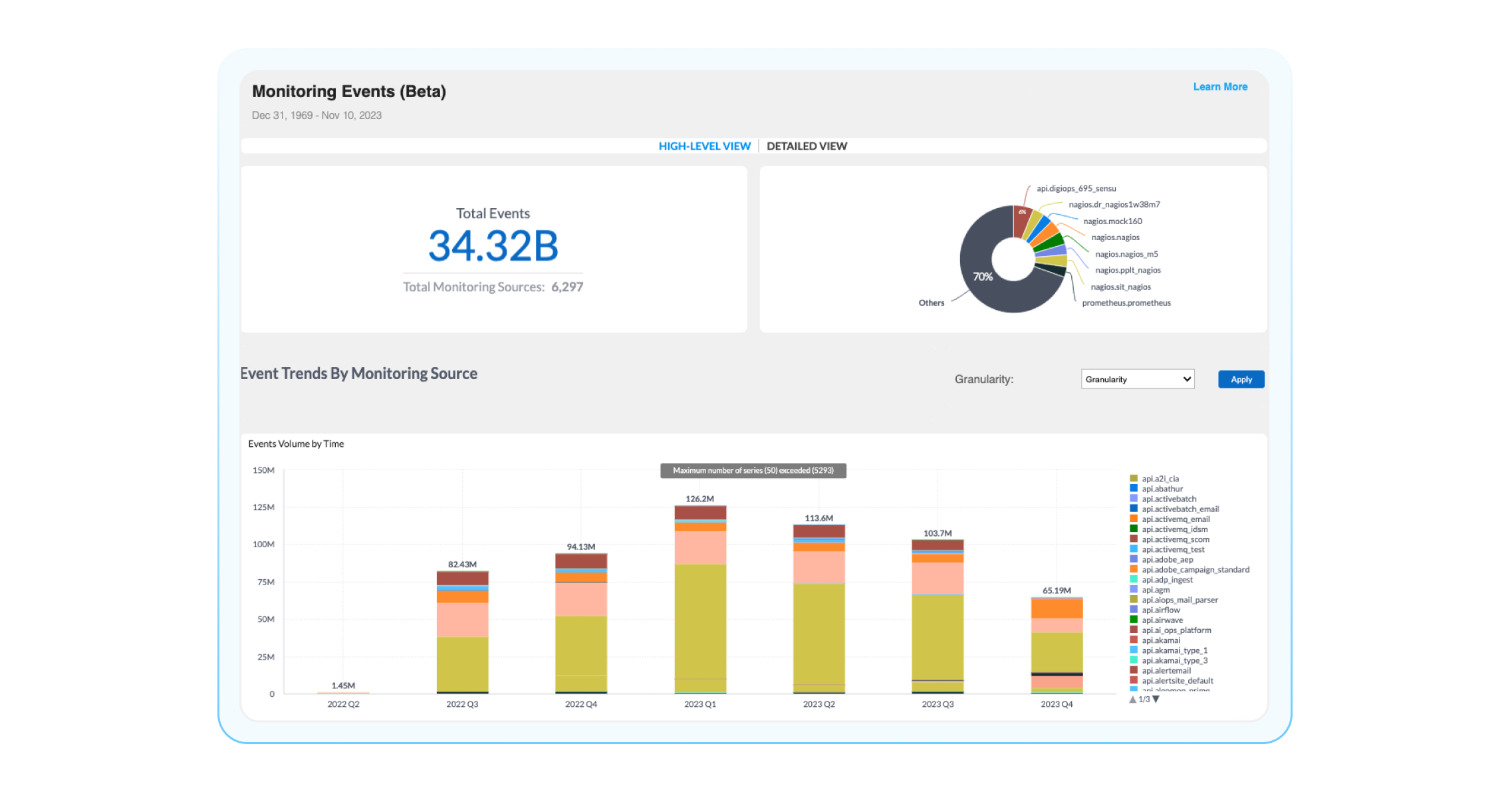
Monitoring Events: Which observability tool creates the most events?
Let’s start with the big picture. I always like to begin with the Monitoring Events Dashboards. This dashboard gives a high-level overview of how BigPanda interacts with your inbound monitoring tools, including event volumes per monitoring source and time. Think of this dashboard as a single pane of glass into all the events your monitoring tools are creating and tracking, which can be very helpful in finding trends and identifying areas for changes.
Questions you can answer using this dashboard are, “How many events are all my observability tools creating?” “Which monitoring tool is creating the most events?” or “When are the most events being created?” Some widgets that can be helpful for you to understand how BigPanda is ingesting data and answer these questions are:

Total Events: Total number of events sent to BigPanda and the number of configured monitoring sources sending those events. If you are wondering how many events are being ingested into BigPanda, this is your go-to source.
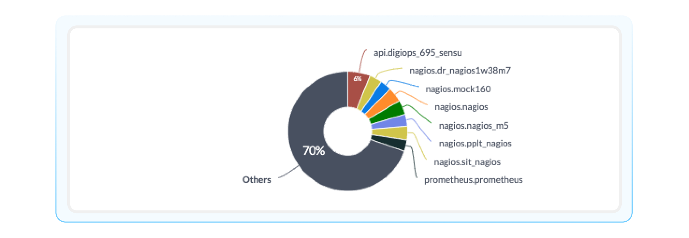
Event Volume by Monitoring Source: A breakdown of events received by each monitoring source. This is helpful in beginning to understand which monitoring tools are creating the most events.
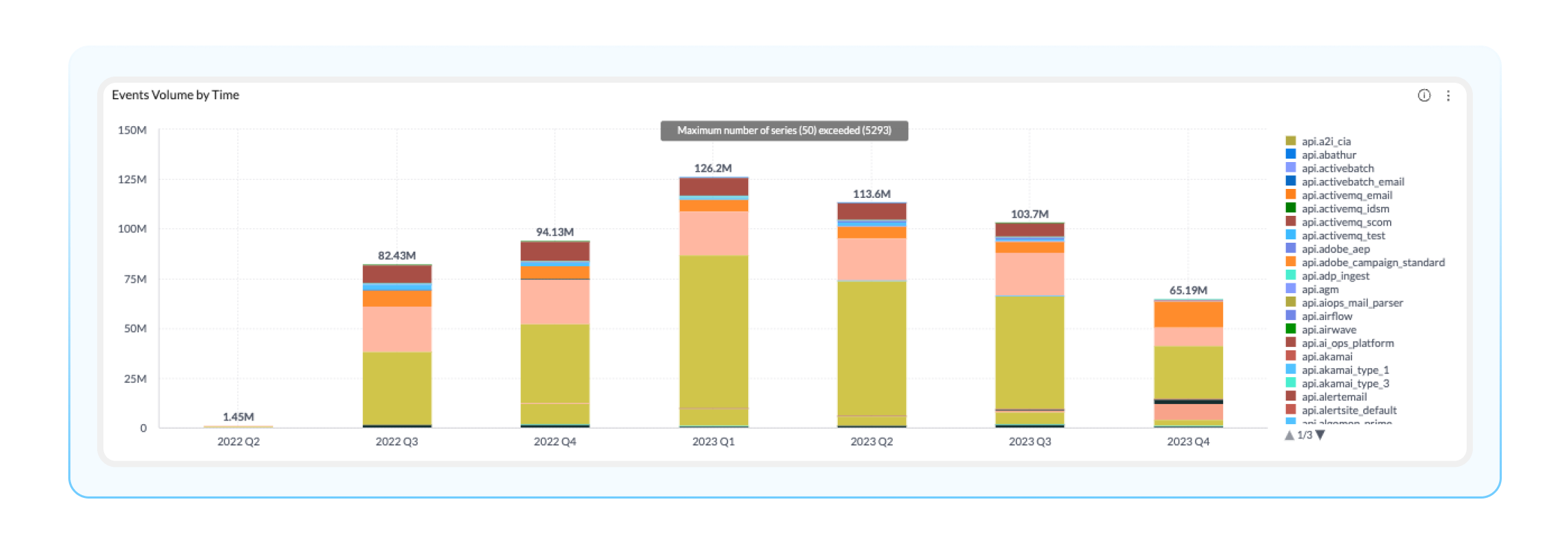
Event Volume by Time: This visualization displays the total event volume by source system for a given time period (all the way down to the hour). This timeline was highly requested by BigPanda admins and can help you identify low-volume monitoring tools for cost-saving or additional investment.
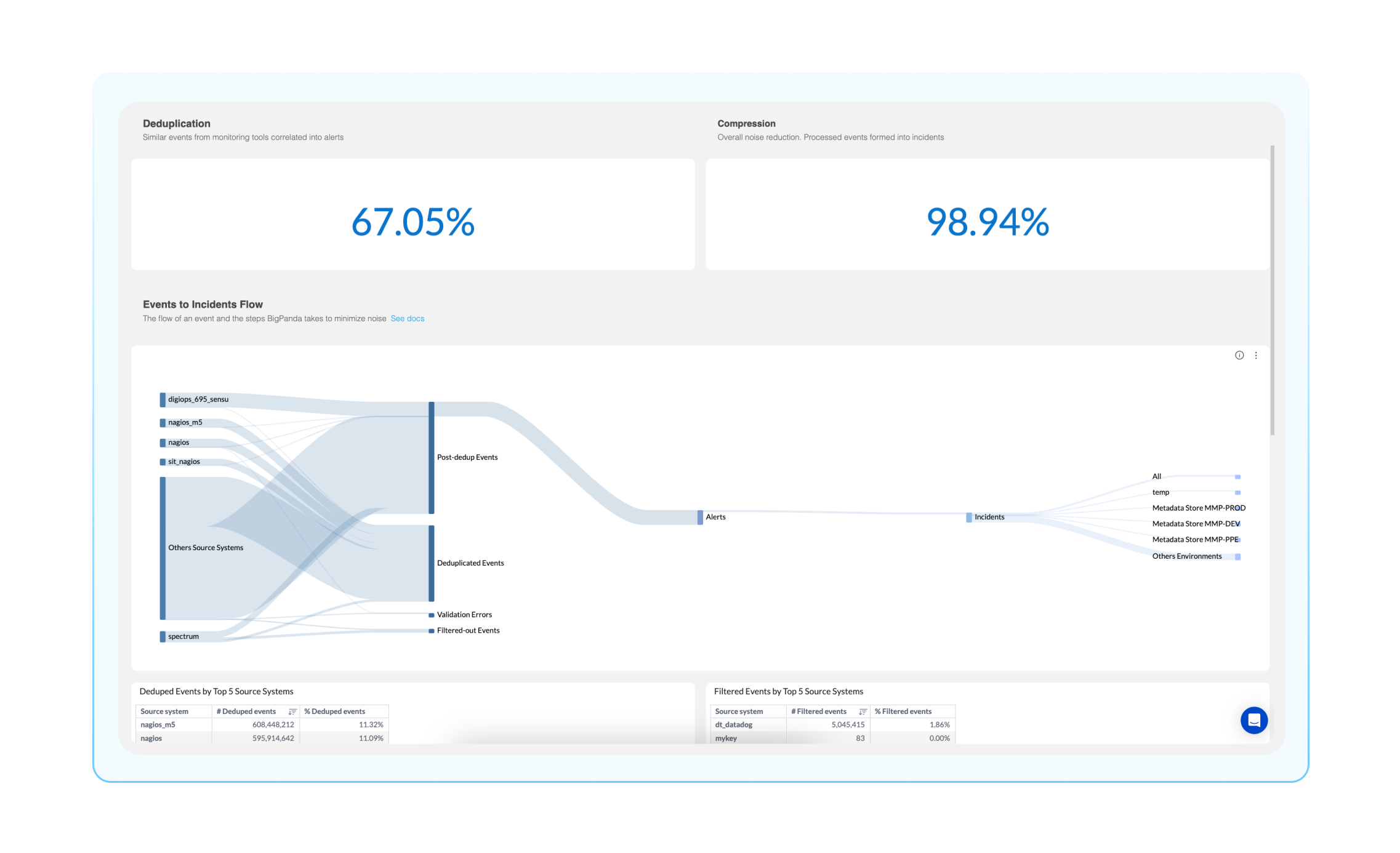
Events Processing: What does BigPanda do with my monitoring events?
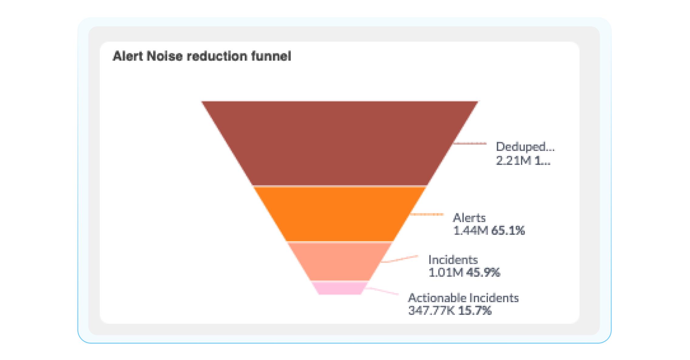
To get a bit more granular, you can view how events are processed in BigPanda using the Events Processing Dashboard. This dashboard gives you a breakdown of how BigPanda processes events from your monitoring tool integration sources. Using this dashboard, you can answer questions such as, ‘How many events are duplicated across all my monitoring tools?’ or ‘How many events are mere noise, and which ones are developing into noteworthy incidents?’ You can answer these questions using the following widgets:
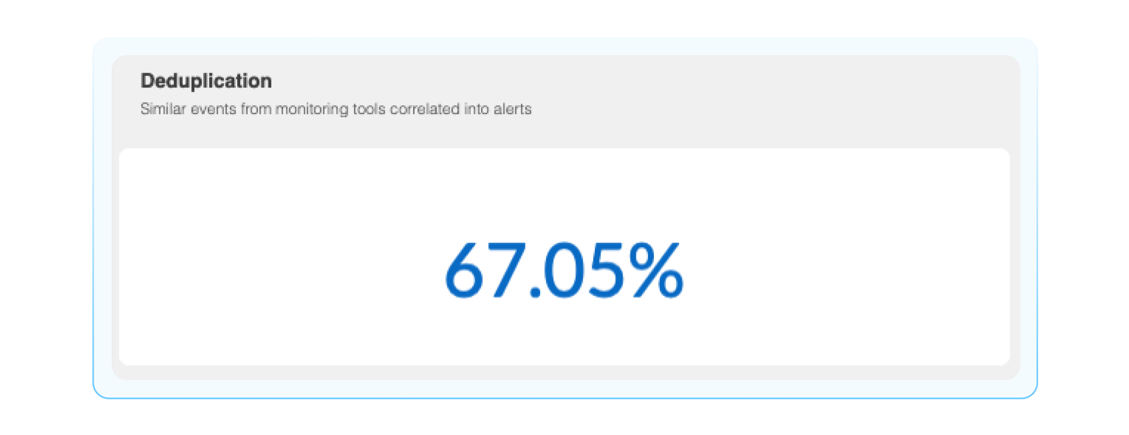
Deduplication: BigPanda groups events into alerts based on matching properties. The deduplication widget shows what percentage of redundant events from monitoring tools are deduplicated prior to becoming BigPanda alerts.
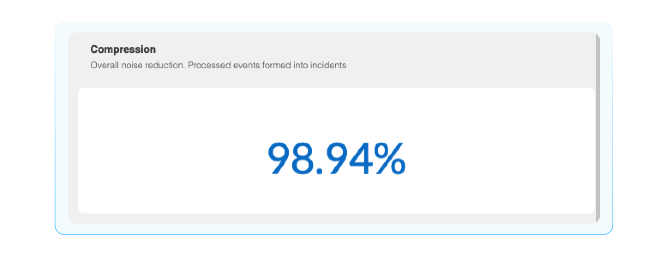
Compression: This is the percentage of events that are compressed into incidents, think of this as a noise reduction number.
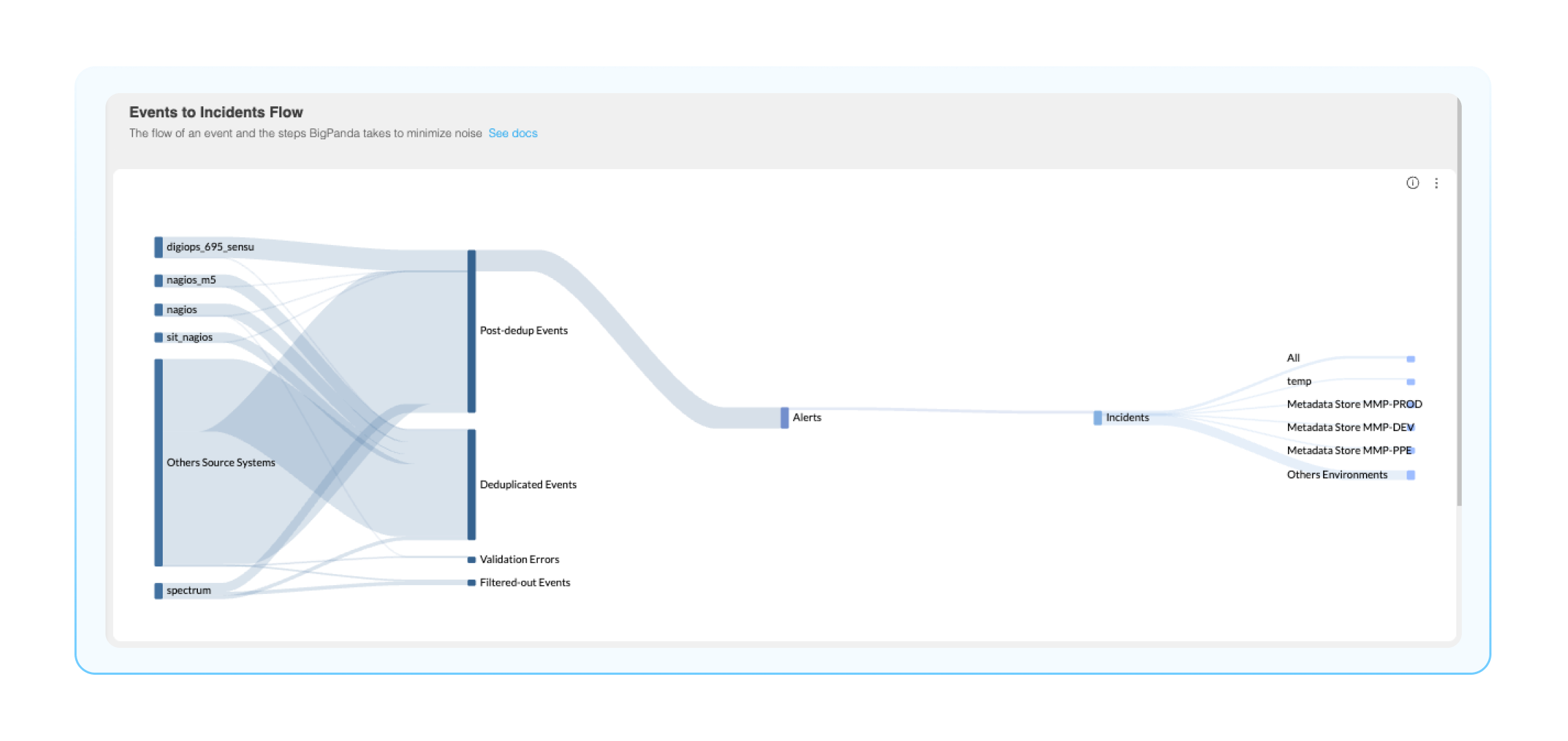
Events to incidents flow: This Sankey diagram is a visual representation of the events to incident lifecycle, from ingestion into BigPanda all the way to the environments these incidents reside. This is an extremely helpful visual representation of your BigPanda pipeline, where you can easily identify how many events are being processed and compressed.
Correlation Patterns: How are my correlation patterns performing?
Correlation Patterns are fundamental definitions that group alerts into incidents. When you start using BigPanda, we set up initial correlation patterns for your organization. As your organization expands, you have the flexibility to create custom correlation patterns.
If you want to see how well these patterns are performing, you can use the Correlation Patterns Dashboard. Some questions you can answer with this dashboard are, “What is the overall compression rate?” “How many alerts are compressed, and out of that, how many incidents are formed?” In this dashboard, there are a couple of widgets to highlight to answer these questions:
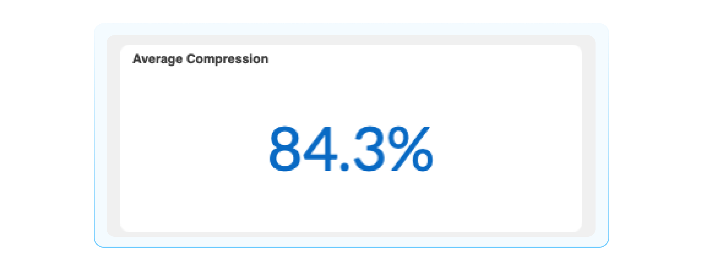
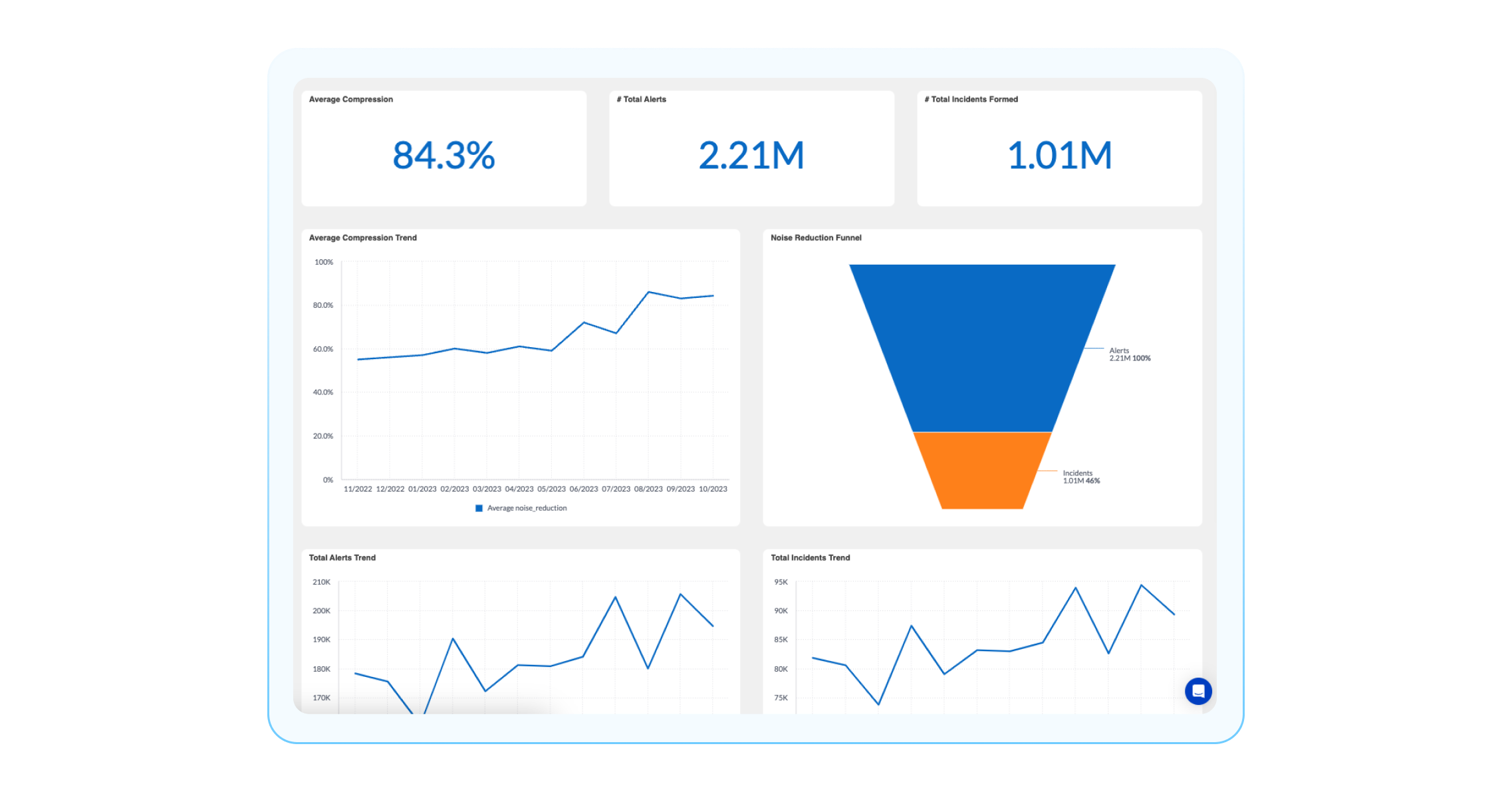
Compression Rate: The percent of processed alerts formed in incidents. This demonstrates the amount of noise reduced by BigPanda’s correlation engine.
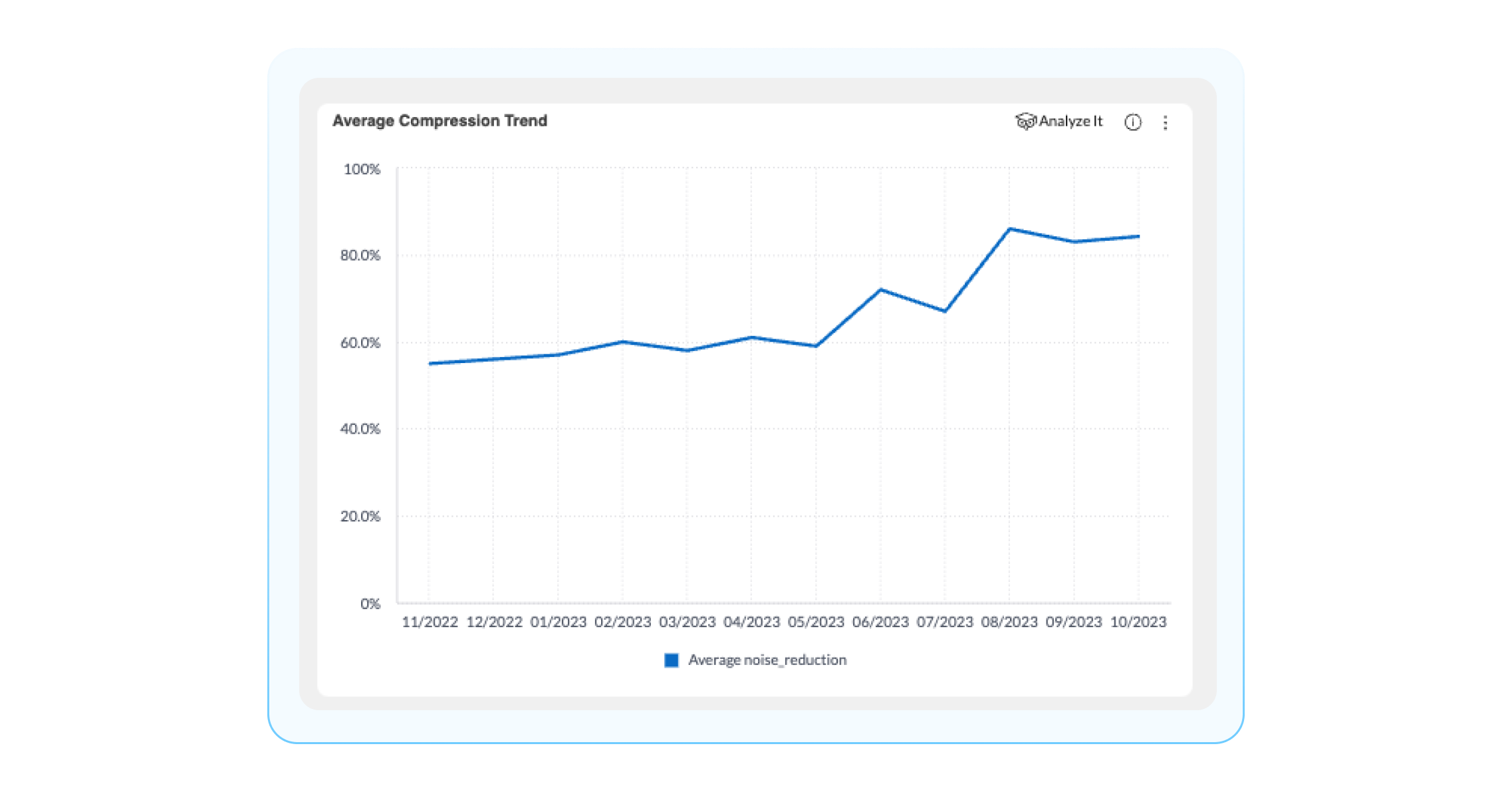
Average compression trend: Average compression percentage over time for incident: actioned, and non-actioned incidents. You can use this widget to find trending compression rate, in order to be able to detect, investigate, and repair issues, ultimately maintaining a high level of noise reduction over time.
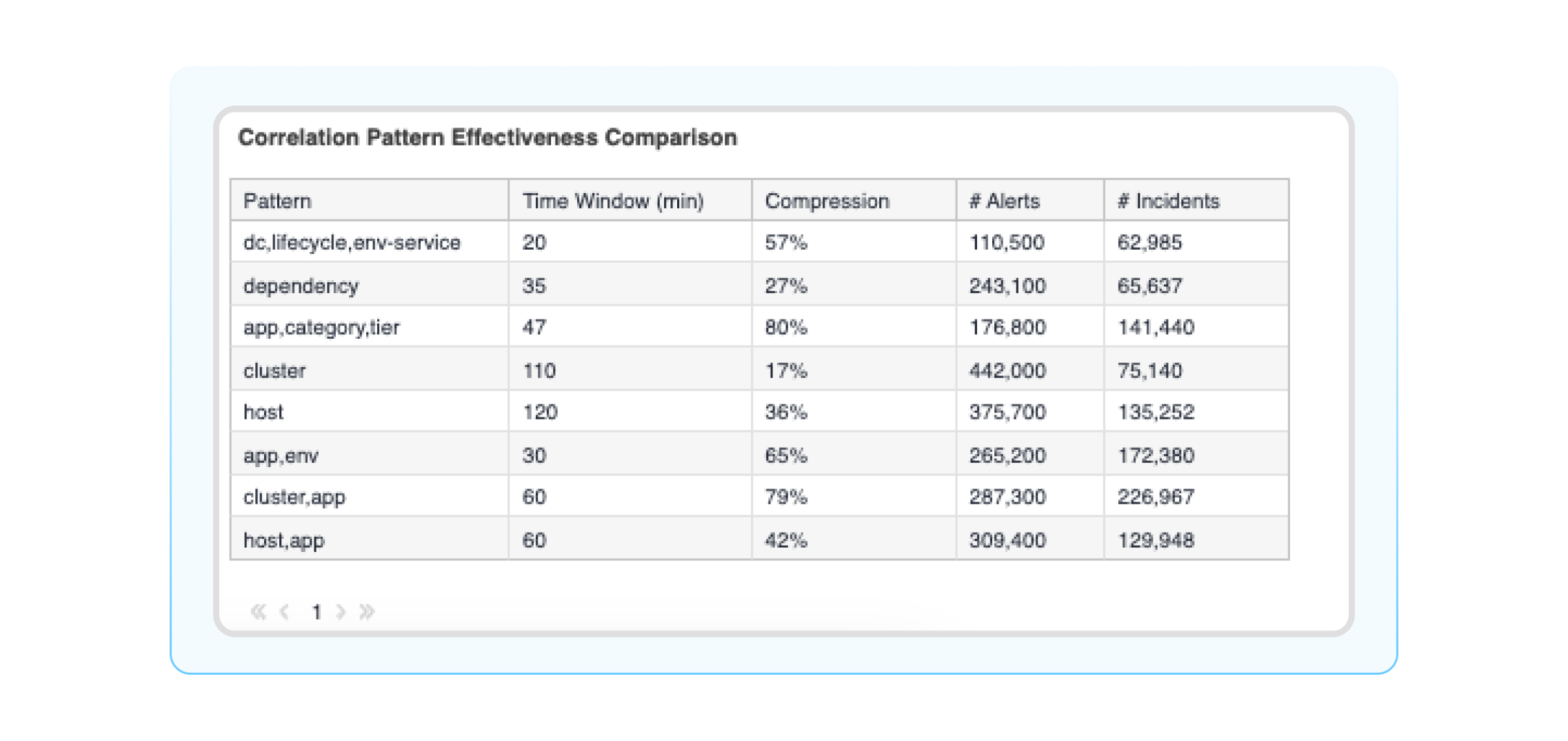
Correlation patterns effectiveness comparison: A detailed table on all your correlation patterns in BigPanda with information about # of alerts, incidents, splits, merges, etc. This widget lets you get into the performance details of your correlation patterns and identify areas to improve configuration settings to reduce noise.
Alert Analysis: When is my environment experiencing the most alerts?
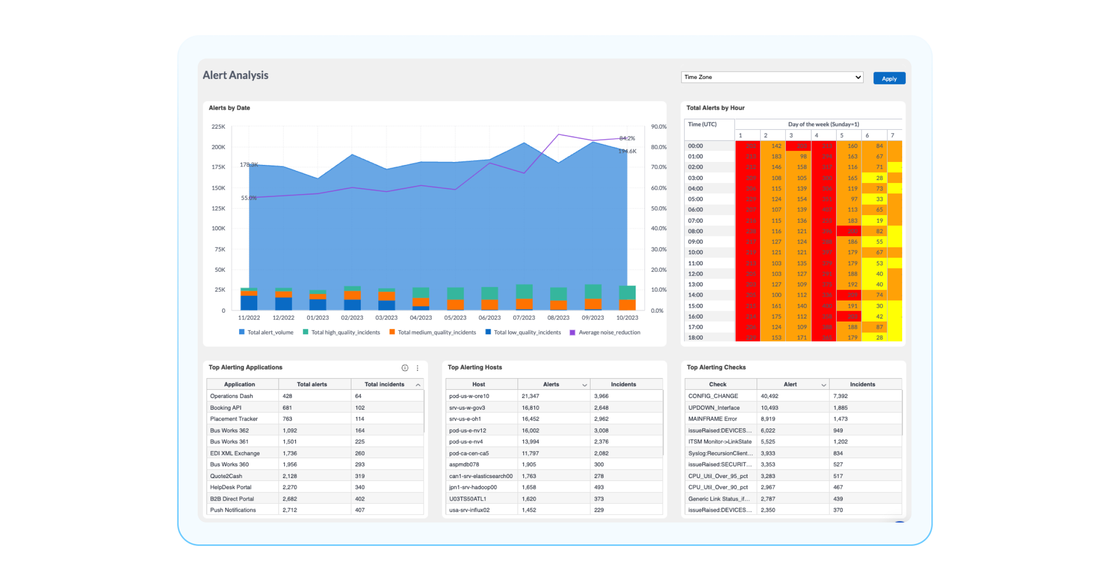
If you want to dive deeper into the alerts that are compressed (aka noise) with BigPanda and gain more context about them, you can use the Alert Analysis Dashboard. The Alert Analysis Dashboard lets you dive into all your alerts and answer questions such as “Which hosts or applications create the most alerts/noise?” or “Which alerts have been the most common in a certain timeframe?” Some widgets in this dashboard that can help you answer these questions are:
Alert quality and reduction over time: This displays the inbound alert payload quality over time. To learn more about your alert quality, check out the new alert quality dashboard.
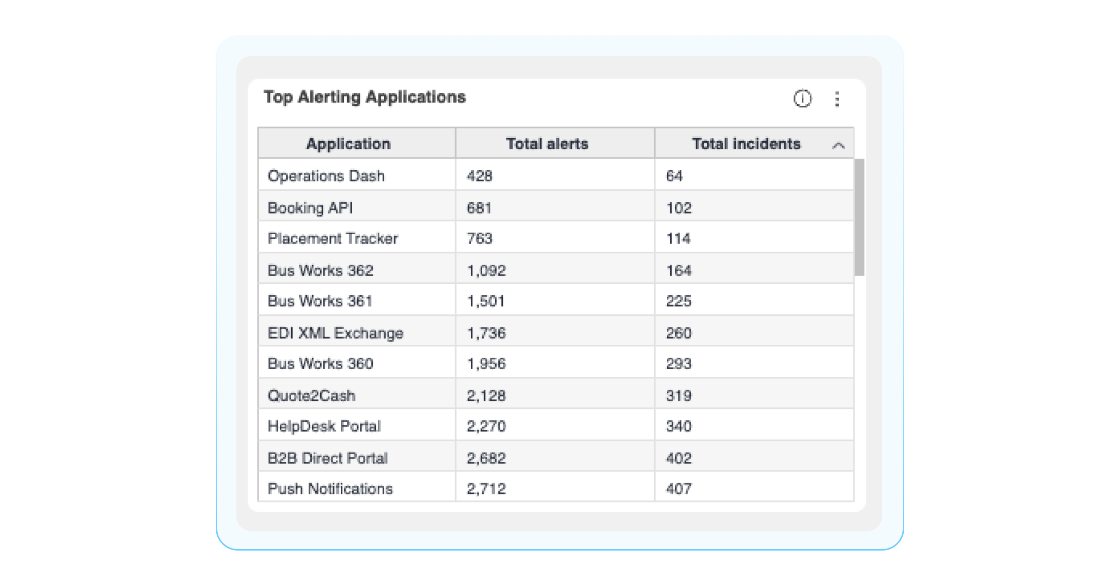
Top Alerting Applications: This aggregates the total number of incoming alerts and incidents created by each application. This can help you identify your noisiest applications.
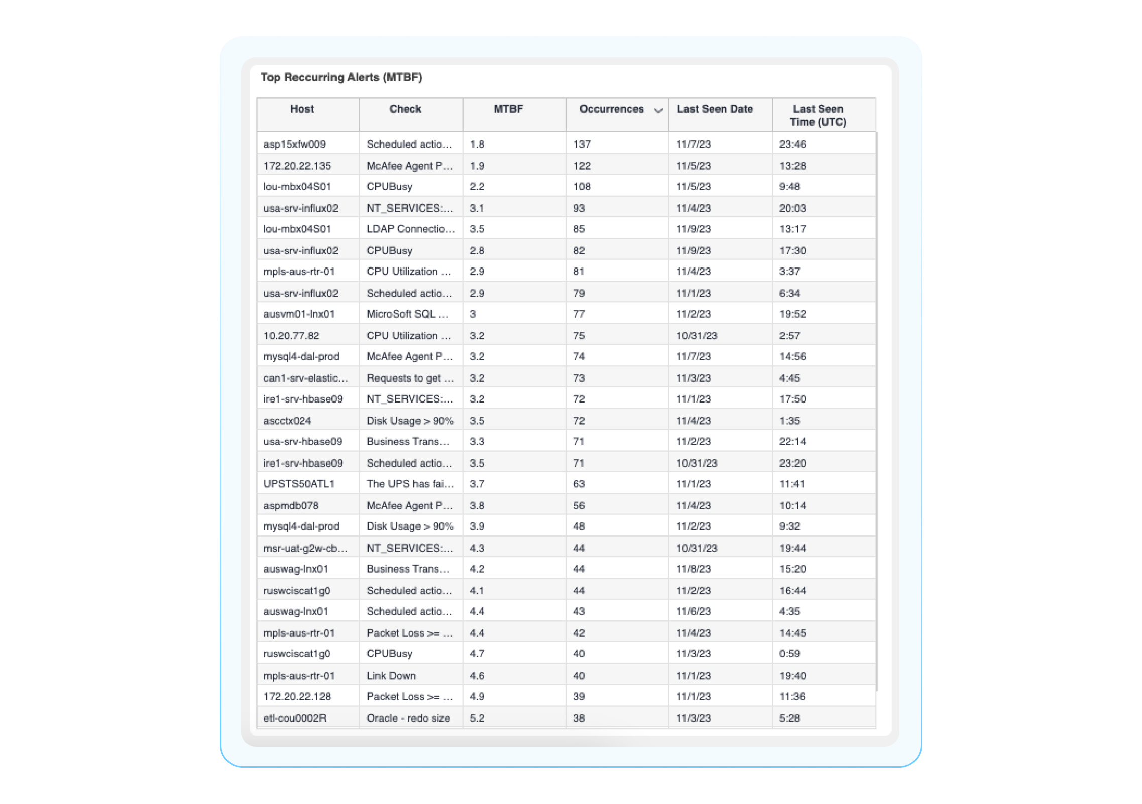
Top Recurring Alerts (Mean Time Between Failure aka MTBF): Alerts are sent to BigPanda most often, with MTBF and the most recent occurrence listed. MTBF is the average amount of time between failures, or the time between when an incident is resolved and when/how often it reoccurs. Monitoring MTBF allows you to see how often certain issues occur and helps you measure the reliability of services.
Key: Gain ITOps visibility with Unified Analytics dashboards
Ultimately, BigPanda Unified Analytics provides the end-to-end visibility of your entire IT operations. The dashboards I shared are excellent tools to help you gain initial insights and address broader questions about your IT operations.
For more information about Unified Analytics, we highly encourage you to visit our helpful docs pages or register for our free Unified Analytics course in BigPanda University.